Hulu
Creative Brief
Find a leading brand with products (or services) that you think needs design help and design thinking. Define a user-oriented problem that you'd like to solve. Think big, and aim for maximum impact.
I chose to redesign the Hulu Website interface with the intent of creating a more engaging and personalized experience.
All opinions are my own and are not in any way affliated with Hulu.
Problem
How to create a better browsing experience?
Because Hulu has so much content, let's improve the navigation
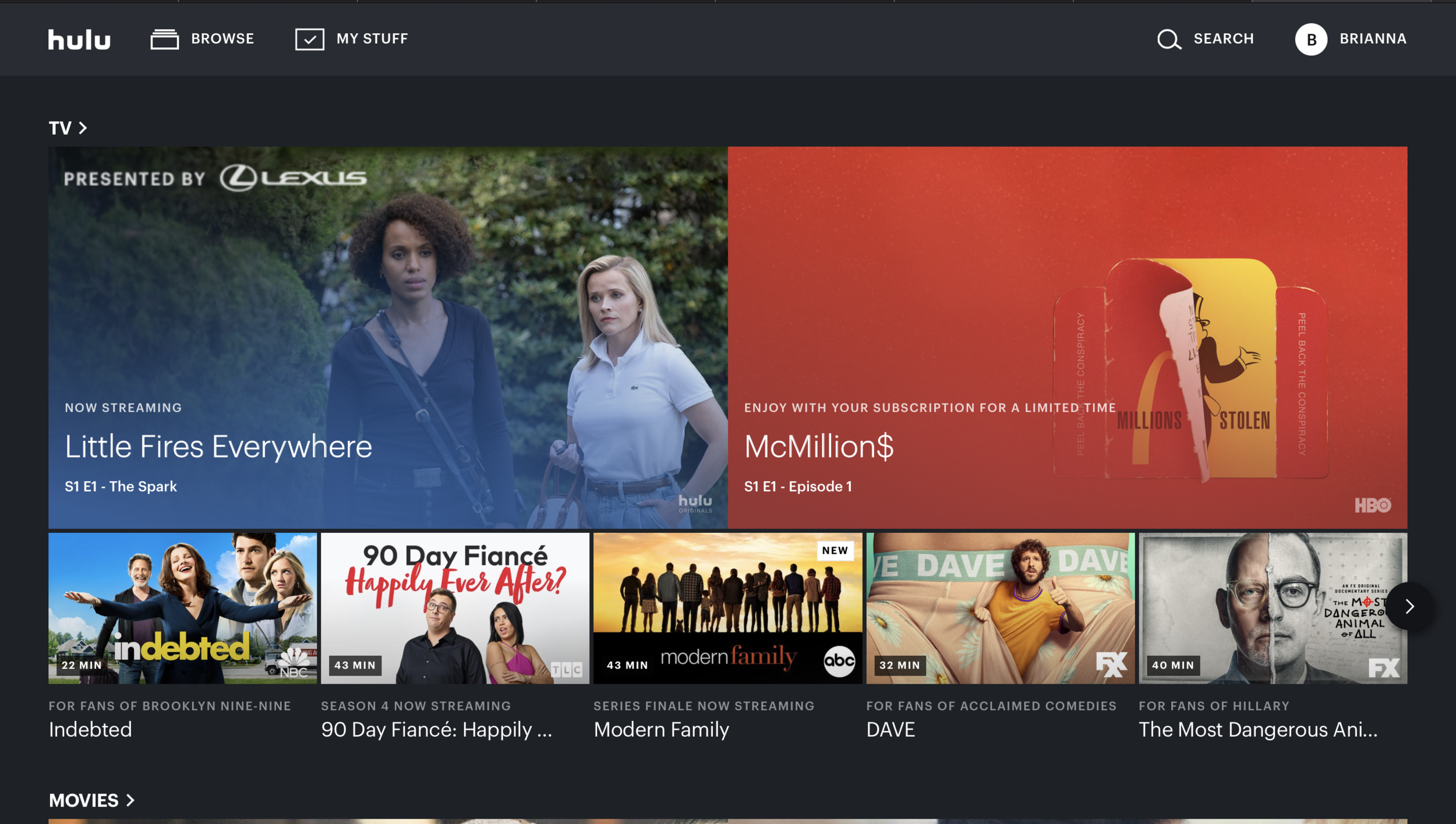
Pictured below are snapshots of the Hulu Website in March of 2020.
Timeline & Tools
This project was developed over the course of 6 weeks.
Tools used for this project include Sketch, InVision, and Figma.

Home Page
This section of the home page is located towards the middle of page.
Navigation Bar
Hulu’s navigation bar is filled with mulitple genres between tv shows and movies. Due to such a convaluted amount of content on Hulu’s site. One problem to address is how to find an easier way to sift through all the content.
Approach
Develop a personalized user experience
Integrate unique bubble designs
Multifaceted functionality
Process & Research
I was unable to complete any formal research, but have communicated my designs and ideas to friends and family. My designs are representative of the ideal intended audience.
Competitor Analysis
Netflix is a streaming service with a variety of content from movies, shows, and originals. Netflix has a personalized browsing experience by creating content recommendations with percentages based on a users watch history.
Amazon Prime Video is another streaming service that includes shows and movies. Similar to its competitors, Prime Video recommends certain content to its users to create a better overall experience.
Disney + is a streaming service that exclusives provides content within the Disney franchise to include shows, movies, and more original content. The browsing experience on Disney + is simple and intuitive to its competitors. Its personalized aspect of the site is a section.
Hulu continues to differentiate itself from other streaming platforms with its varying subscription options. Compared to my competitors Hulu incoporates multiple financial plans that argubly makes the platform more marketable and feasible to prospective users. Given the companies unique subscription opportunities, Hulu can further set themselves apart from other platforms by integrating a new explatory feature.
Prospective End User
The explore feature for the Hulu web page redesign is centered around creating a new and unique content browsing process for any prospective users who may be interested in navigating through Hulu’s available content.
Sketches
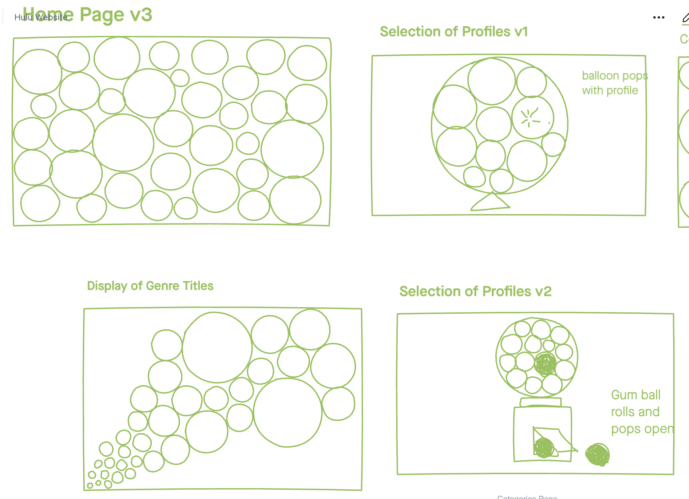
Here I began with a different shape design in mind. I began with a typical rectangle arrangement format and then switched to a circle/bubble format. My intent with the bubble format was to create animated, creative experience that simulated bubbles on a screen.


WireFrames
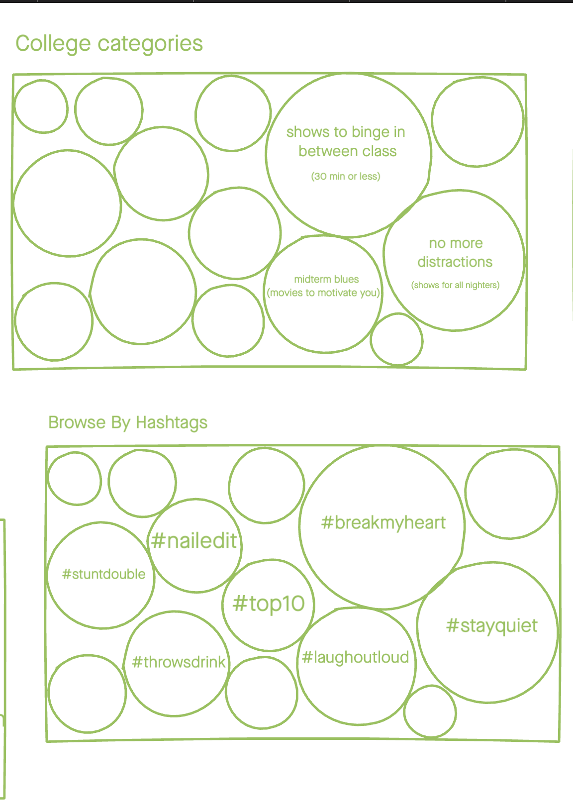
These wireframes are a more complete thought process around exploring different categories on the Hulu website. Also within the bubble shape experience, the genres of tv show and movie titles are personalized to the user.
Implementations
Dramatic animation with floating and popping bubbles
More tailored experience with content
Reflections
Hulu’s web page has been updated recently, the new navigation features do address the original convaluted navigation process. However, there is still room for improvement in personalizing the availble content to a prospective user. Given my approach to redesigning the web page, I plan to continue to explore and research to further cultivate a explore feature that is personalized and unique to each Hulu subscriber.


